

How To Create A Bar Chart In Python
Introduction
We all love exploring data. Representing data and interpreting or extracting important information has been a major work of data scientists and this part is called exploratory data analysis. There are many different representations to show data. One of the important diagrams is a Bar Plot and is widely used in many applications and presentations. In this article, we will use Python to understand and implement bar plots.
What are bar plots?
A bar graph is a graphical representation of data in which we can highlight the category with particular shapes like a rectangle. The length and heights of the bar chart represent the data distributed in the dataset. In a bar chart, we have one axis representing a particular category of a column in the dataset and another axis representing the values or counts associated with it. Bar charts can be plotted vertically or horizontally. A vertical bar chart is often called a column chart. When we arrange bar charts in a high to low-value counts manner, we called them Pareto charts.
How to create a bar plot in Python?
In python, we use some libraries to create bar plots. They are very useful for data visualizations and the interpretation of meaningful information from datasets. Some libraries that we use to create a bar chart.
Matplotlib:
Matplotlib is a maths library widely used for data exploration and visualization. It is simple and provides us with the API to access functions like the ones used in MATLAB. We import the library as plt and use:
plt.bar(x, height, width, bottom, align)
The code to create a bar plot in matplotlib:
import numpy as np import matplotlib.pyplot as plt # Dataset generation data_dict = {'CSE':33, 'ECE':28, 'EEE':30} courses = list(data_dict.keys()) values = list(data_dict.values()) fig = plt.figure(figsize = (10, 5)) # Bar plot plt.bar(courses, values, color ='green', width = 0.5) plt.xlabel("Courses offered") plt.ylabel("No. of students enrolled") plt.title("Students enrolled in different courses") plt.show() 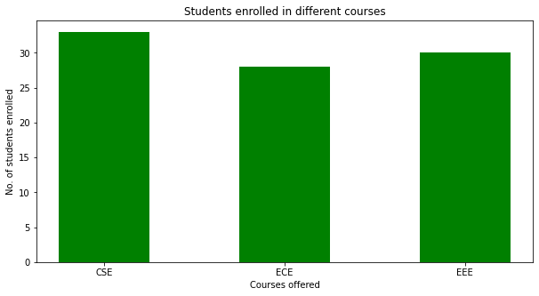
Seaborn:
Seaborn is also a visualization library based on matplotlib and is widely used for presenting data. We can import the library as sns and use the following syntax:
seaborn.barplot(x=' ', y=' ',data=df)
The code to create a bar chart in seaborn:
import seaborn as sns import matplotlib.pyplot as plt df = sns.load_dataset('tips') sns.barplot(x = 'time',y = 'total_bill',data = df) plt.show() 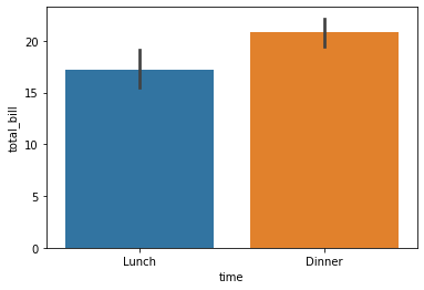
Plotly:
Plotly is an amazing visualization library that has the ability to interactive presentation, zooming into locations, and handling various design representations. It is widely used for readable representations and we can hover over the chart to read the data represented. It is also used for higher-dimensional data representation and has abstraction to represent data science and Machine learning visualizations. We use plotly.express as px for importing plotly.
px.bar(df, x=' ', y=' ')
The following is code to create a bar chart in Plotly:
import plotly.express as px data_canada = px.data.gapminder().query("country == 'Canada'") fig = px.bar(data_canada, x='year', y='pop') fig.show() .png)
Unstacked bar plots:
Unstacked bar plots are used when we cant to compare a particular category over time with different samples. It can be used to deduct some facts from the pattern we observe through the comparison. Like in the figure below, we can see the players' ratings over the years in FIFA. We can see that Django and Gafur have been increasing ratings over years. This shows us their progression and so a club can now decide if they want to sign Django or Gafur.
import pandas as pd plotdata = pd.DataFrame({ "2018":[57,67,77,83], "2019":[68,73,80,79], "2020":[73,78,80,85]}, index=["Django", "Gafur", "Tommy", "Ronnie"]) plotdata.plot(kind="bar",figsize=(15, 8)) plt.title("FIFA ratings") plt.xlabel("Footballer") plt.ylabel("Ratings") 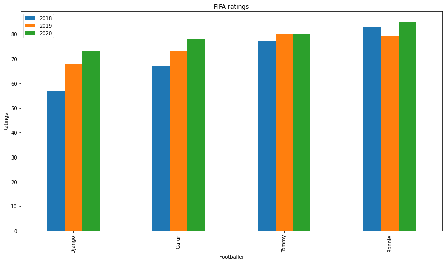
Stacked bar plots:
As the name suggests, stacked bar plots have each plot stacked one over them. As we saw earlier that we had used an unstacked bar chart for the comparison of each group, we can use a stacked plot for the comparison of each individual. In pandas, this is easy to implement using the stacked keyword.
import pandas as pd plotdata = pd.DataFrame({ "2018":[57,67,77,83], "2019":[68,73,80,79], "2020":[73,78,80,85]}, index=["Django", "Gafur", "Tommy", "Ronnie"]) plotdata.plot(kind='bar', stacked=True,figsize=(15, 8)) plt.title("FIFA ratings") plt.xlabel("Footballer") plt.ylabel("Ratings") 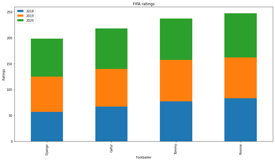
Now, let us apply these syntaxes to a dataset and see how we can plot bar charts using different libraries. For this, we will use the Summer Olympics Medal 1976- 2008 dataset and visualize it using bar graphs to generate univariate, bivariate, and multivariate analysis and interpret relevant information from it.
The Summer Olympics dataset from 1976 to 2008 is available here.

Univariate Analysis:
In exploratory data analysis, Univariate analysis refers to visualizing one variable. In our case, we want to visualize column data using a bar plot.
All Time Medals of top 10 countries:
top_10 = df['Country'].value_counts()[:10] top_10.plot(kind='bar',figsize=(10,8)) plt.title('All Time Medals of top 10 countries') .png)
The graph shows the top 10 countries that have won Olympic medals. The USA has dominated in olymics over the years.
Medals won by the USA in Summer Olympics:
indpie = df[df['Country']=='United States']['Medal'].value_counts() indpie.plot(kind='bar',figsize=(10,8))
.png)
We filter the country to the USA and visualize the medals won by the USA alone.
Bivariate Analysis:
The bivariate analysis includes two variables or two columns from our dataset.
Total Athletes contribution to summer Olympics over time:
plt.figure(figsize=(10, 5)) sns.countplot(df['Year']) plt.title('Total Athletes contribution in summer olympics over time') plt.xlabel('Years') plt.ylabel('No. of Athlete') .png)
Over the years there has been an increase in the participation of athletes in the Olympics.
Top 10 Athletes with the most awarded Medals:
athlete_order = df['Athlete'].value_counts().head(10).index plt.figure(figsize=(9, 5)) sns.countplot(data=df, y='Athlete', order=athlete_order) plt.title('Top 10 Athletes with the most awarded Medals') plt.xlabel('No. of awrded medals') plt.ylabel('Athlete Name'); .png)
This plot is also called the horizontal bar plot and here we can see Micheal has won the most medals in Olympics. This bar graph has the top 10 athletes.
Sports with most awarded Medals:
plt.figure(figsize=(15, 5)) highest_sport = df['Sport'].value_counts().index sns.countplot(data=df, x='Sport', order=highest_sport) plt.xticks(rotation=75) plt.title('Sports with most awarded Medals') plt.xlabel('Sport') plt.ylabel('No. of Medals') .png)
Aquatics has contributed to the most number of medals in the Olympics. One point to see in this graph is we have used a rotation of 75 to text.
Type of medals won over the years:
sns.countplot(x='Year',hue='Medal',data=df) sns.set(rc={'figure.figsize':(10,10)}) plt.title("Type of medals won over the years") .png)
The graph is an unstacked barplot and shows medal grouping over each year.
Medals by Gender:
sns.countplot(x="Medal", hue="Gender", data=df)
.png)
The gender bar plot tells us that men have participated more in Olympics or we can see men category games have been more in Olympics.
The gender ratio in summer Olympics:
gender_group = df.groupby(['Year', 'Gender']).size().unstack() gender_group.apply(lambda x:x/x.sum(), axis=1).plot(kind='barh', stacked=True, legend=False) plt.legend(['Men', 'Women'], bbox_to_anchor=(1.0, 0.7)) plt.xlabel('Men / Women ratio') .png)
The data tells us the ratio of men to women in the Olympics over the years and we can see that more women category games are coming up recently and it's a great sign.
Medals by Gender in each Discipline:
sns.countplot(y='Discipline',hue='Gender',data=df) sns.set(rc={'figure.figsize':(10,10)}) plt.xticks(rotation=90) plt.title('Medals by Gender in each Discipline') plt.legend(loc=1) # 1 is code for 'upper right'3 .png)
This graph shows each gender's participation in the specific discipline.
Multi-Variate Analysis:
Multivariate analysis is used when we want to compare more than two categories. Usually, a boxplot is a good representation as shown here.
sns.catplot(x="Medal", y="Year", hue="Gender",kind="box", data=df)
.png)
This graph shows us that in all three medals, men have been winning moreover women in Olympics over the year.
References:
- https://matplotlib.org/
- http://seaborn.pydata.org/index.html
- https://plotly.com/
Conclusion:
In this article, we have gone through different implementations of Bar plots in Python and understand the different types of plots we use for exploratory data analysis using bar graphs.

https://gitmind.com/bar-chart-maker.html
Code: https://colab.research.google.com/drive/1YkyaoUNNXZVw_MYgNK4Wx2XlM2Uwap2k?usp=sharing
Preview Image Source: https://unsplash.com/photos/eveI7MOcSmw
About Me: I am a Research Student interested in the field of Deep Learning and Natural Language Processing and currently pursuing post-graduation in Artificial Intelligence.
Feel free to connect with me on:
1. Linkedin: https://www.linkedin.com/in/siddharth-m-426a9614a/
2. Github: https://github.com/Siddharth1698
The media shown in this article are not owned by Analytics Vidhya and are used at the Author's discretion.
How To Create A Bar Chart In Python
Source: https://www.analyticsvidhya.com/blog/2021/08/understanding-bar-plots-in-python-beginners-guide-to-data-visualization/
Posted by: cundiffthaveling73.blogspot.com
0 Response to "How To Create A Bar Chart In Python"
Post a Comment